Brand kit
How Partnexa should look, everywhere
One mark, one palette, one type scale. Use this page whenever Partnexa appears on the web, in an app store listing, or on a social card.
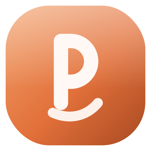
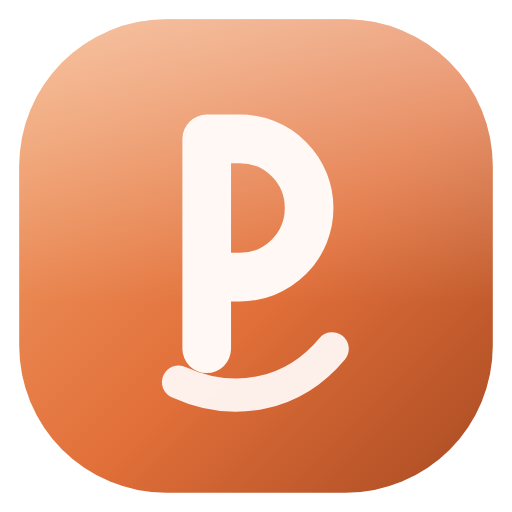
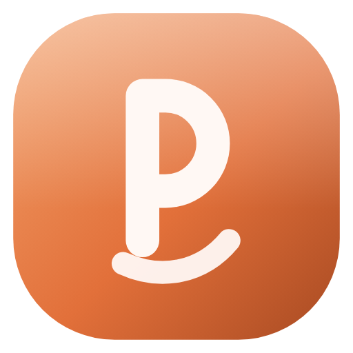
The logo
Dark surfaces
Light surfaces
Animated mark
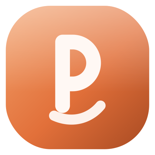
The lockup. Mark and wordmark always share a baseline, with the gap equal to a quarter of the tile width. The animated variant freezes automatically when a visitor has reduced motion enabled.
Files

Colour
Ember
var(--ember)
Primary accent, CTAs, the logo tile.
Ember soft
var(--ember-soft)
Gradient highlight and hover states.
Background
var(--background)
The dark base every surface sits on.
Card
var(--card)
Panels, cards and elevated surfaces.
Foreground
var(--foreground)
Primary text on dark surfaces.
Muted
var(--muted-foreground)
Secondary text, captions and labels.
Always reference the token, never a raw hex value — that is what keeps light and dark surfaces consistent.
Typography
Display / headings
Train hard. Recover deep.
Body
Body copy stays plain and direct. Short sentences, no hype, no exclamation marks. If a sentence could appear in a supplement ad, rewrite it.
Numerals
185 lb · 5×5 · RPE 8
Usage rules
Do
- Keep clear space of at least half the tile width on every side.
- Use the light-surface variant on white, cream or paper backgrounds.
- Use the animated mark only once per page, on landing heroes.
- Pair the wordmark with the mark at the same optical height.
Don't
- Don't recolour the tile or the monogram.
- Don't stretch, rotate or add outer strokes to the mark.
- Don't place the mark on a busy photo without a solid backing shape.
- Don't rebuild the wordmark in another typeface.